Saturday 27 February 2010

Double page analysis


I can see that this article is simple but effective, The background is all white apart from one of the pictures background. This is an article from "Blender" magazine so it will be aimed and teenagers and young adults presumingly female because females may idolize these singers and aspire to be like them by following their fashion or their makeup or even their music. By the outfits the band is wearing it is trying to appeal to males as well; by wearing short skirts and dresses this is boosting their sex appeal. It can also try and be appealing to males by making the girl pose by a car, because a lot of males like girls and cars. "Electrik red" has been written in blue, by doing this is makes me reader think why? It would be very "normal" to write the title in red but they have chosen to write it in blue to be different and stand out. The writing is spread out across both pages, this is a good way in presenting a double pages spread because it may be off putting if a whole page of writing is there to read so but using the space wisely makes it seem like there is less to read which maybe a plus.

Thursday 25 February 2010

Photoshop attempt

These are two practice attempts at photoshop. It was my first time using photoshop and i found it quite easy to get used to it. I tryed two different pictures and i am confident that my final pictures on my magazine will be to a high standard.


Monday 22 February 2010

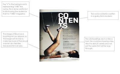
Contents Analysis


This is a contents from "VIBE" magazine, it's audience is female and male, teenagers and young adults. It is a pop/R&B magazine.


Friday 19 February 2010

Front cover analysis 2


This in another analysis of Blender magazine, i did two because i thought it was very interesting how they portrayed the title beind the image when a female is on the magazine and in front of the image when a male is on the cover.

Sunday 14 February 2010

Front Cover Analysis


Blender is a magazine aimed at teenagers and young adults, I see this by the stars that are used on the front covers and also the language that is used. This is the type of magazine i would like to make as my own.

Thursday 11 February 2010

Mood board for magazine cover.

Today i created a mood board to inspire the cover my magazine, I used images relating to the genre of the magazine i am going to create.

As you can see it is aimed at a female audience, with the colours pink and all the accessories. I plan to make another mood board to get some more inspiration for my magazine.

Wednesday 10 February 2010

My chosen Genre.

I have chosen to create a pop/R&B magazine. I listen to a large variety of music but i chose this because this is the music i probably listen to the most so i am interested in this type of genre. Plus the music i listen to can give me inspiration for my own magazine.
Bands and singers that will influence my magazine will be:


Tuesday 9 February 2010

Analysis of the Media Language.

Semiotics: Is the study of different conventions such as colours, gestures, photography and words.

Pictures can influence how we feel and what we think, for example:
A rainy day can represent anger, sadness or bad days but it can also represent love and romance.


Sunny Day can represent happiness with friends, late nights, hot, fun and romance.


Also colours can effect the way that we see different things, for example:
Red can be seen as,
  • Lust
  • Love
  • Romance
  • Anger
  • Death
  • Danger
  • Blood
Blue can be seen as,
  • relaxed
  • boy colour
  • illness
  • coldness
  • sadness

Sunday 7 February 2010

College contents mock up.


This is a mock up for what my contents would look like in my College magazine. I think it is simple but includes the appropriate information. The mast head is located at the top of the page so it is the first thing you look at when you open it. Also i thought it would be right to have a picture of the school in the contents just for recognisation.

Saturday 6 February 2010

Archbisoph becks newsletter analysis.


I believe that this newsletter is more attractive and eye catching than the Deyes High School newsletter, i think this because:
  • More colours, the colours contrast and stand out
  • Main picture, it has a new picture each newsletter to show what new things are happening in the school.
  • The layout is spaced out and everything has not been squashed together.
  • There is a lead on the cover, about the main new activity that took place, which makes you read more.
I believe this is more of a magazine rather than a newsletter, it seems that Archbishop becks newsletter is more to entertain and inform compared to the Deyes newsletter which is just to inform.

Thursday 4 February 2010

Analysis of Deyes High School newsletter


This is the front cover for Deyes high school newsletter. During analysing this article i found that the whole cover is poor, due to conventions such as


  • No colouring


  • Faded logo


  • Nothing eye catching e/g no big pictures


  • There is no shape to the cover


Reasons for this cover being "boring" as such could be because it is more on a booklet presenting information rather than an actual magazine, it is designed to get important information to students and parents/guardians and not for entertainment. Also it is cheaper, because if these newsletters are being produced in mass production then it is cheaper rather than printing big colourful newsletters.